ShopDreamUp AI ArtDreamUp
Deviation Actions
Suggested Deviants
Suggested Collections
You Might Like…
Featured in Groups
Description
OC's used:
fav.me/day1p0v
fav.me/dax29dl
+++++
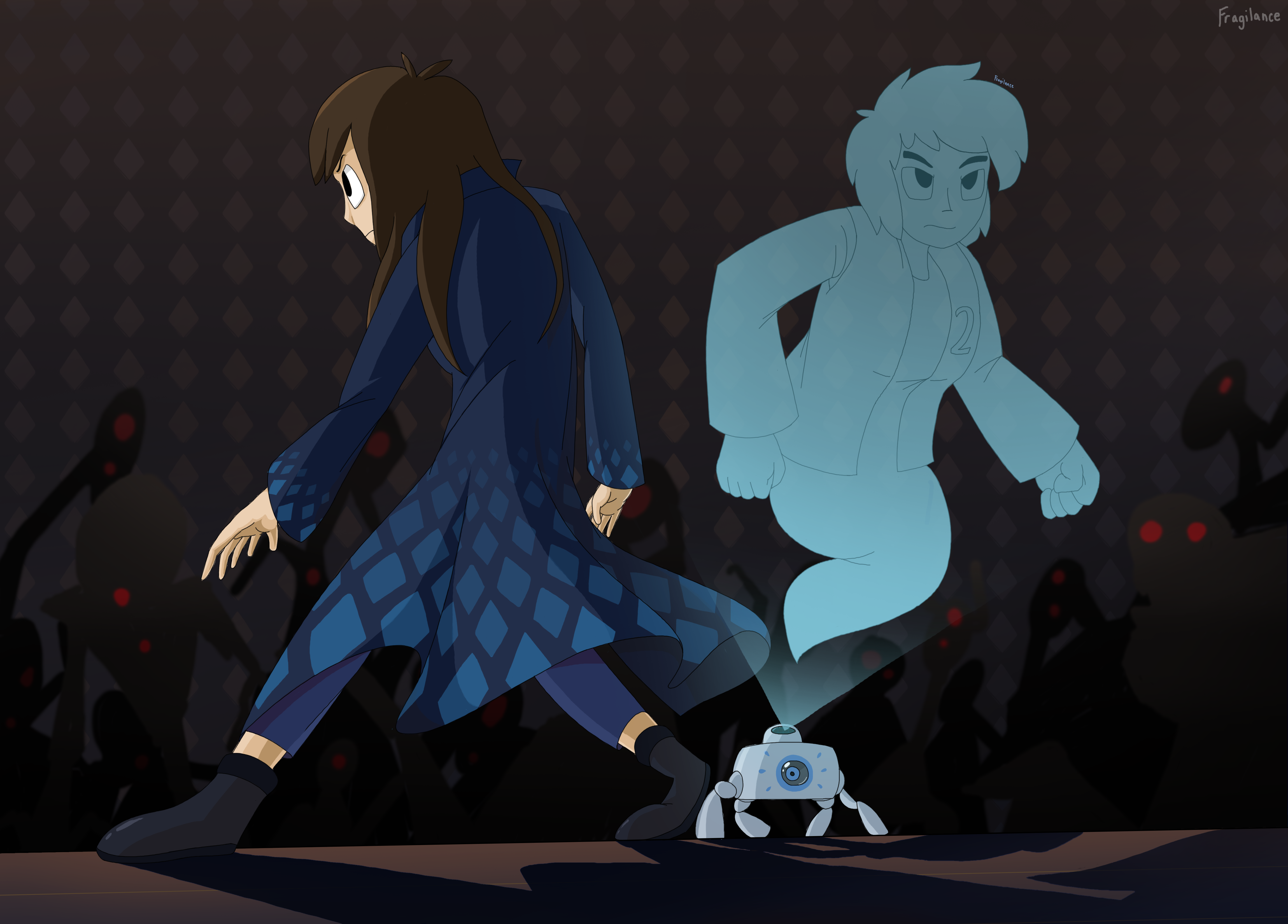
In this picture I wanted to try using a thin outline instead of the thick outlines I usually do. So far, it turned out pretty good. Though I'm a bit iffy about how I made their shadow's project.
fav.me/day1p0v
fav.me/dax29dl
+++++
In this picture I wanted to try using a thin outline instead of the thick outlines I usually do. So far, it turned out pretty good. Though I'm a bit iffy about how I made their shadow's project.
Image size
4599x3300px 3.84 MB
© 2017 - 2024 Fragilance
Comments10
Join the community to add your comment. Already a deviant? Log In
The thing that stands out the most about this piece is the atmosphere and general composition. The dark, unclear silhouettes and dull red eyes of the monsters emerging from the darkened background really gives an aura of menace that you pull off fantastically. The brightly coloured and clear main characters give a fantastic contrast and centers the action. The color pallet of the two also makes them stand out, but not so much that they would be jarring or out of place with the scene. The expressions of determination and posing really drives home both the stakes of the coming shadows, and shows a very cool, but subtle interaction between the two characters. Fantastic job all around.
A few points that you may want to consider in the future though. The proportions and posing seem a little off, especially Jennifer's right arm. Its a bit too long and stiff, especially when compared to the nice flowing cloth effect in her clothing. Her back as well is very stiff and doesn't show off that motion very well and looks very strained and mechanical. Her head doesn't really seem to fit properly with her shoulders, as it is a bit too forward. When you draw a character, especially in a dynamic pose, make sure to consider the neck. Jennifer's neck would be both very long and oddly angled the way it is positioned relative to the shoulders. The other main issue is the shading. While the shading is pretty good overall, there seems to be conflicting light sources between the shadows on the floor and on the main characters.
Another things this piece does really well are some of the more subtle details. I like that Jennifer's diamond-pattern is repeated on the background wall. Its a nice touch that ties the foreground and background together. It also leads a viewer to speculate a connection between the setting and the characters, and that there may be more going on that just a one shot-image. Very nice work on that. Maxwell's robot is pretty nicely drawn and the semi-transparent nature of his hologram is a nice touch, as is the gradual fading from top to bottom. All in all, a pretty nice picture. Keep up the good work!
Discovered via


